Pages

Friday, 27 September 2013

The wind, my mobile and the Space Shuttle

Last week's post was about the fluctuations in wind and solar with time.  The week is an attempt to understand how wind speed varies with location.  What might be called a reference for wind speed in our area is the METAR reports from an airfield approximately 10 km to the west, Most of the time, this is upper limit of the wind speed which will be found in the wider town and country where the variations are significant. This is can be seen in the observations from personal weather stations on the Weather Underground, these are a valuable source of data, but as many of them are located in urban areas it is difficult to separate out the effects of terrain from rooftops.

The research plan was simple, go for a walk in the countryside with a wind speed meter and record the location of the readings using the GPS on my mobile phone.  As an aside, if you want perfect isolation from your fellow man, simply wander around with a clipboard and a measuring device and no one will come near you, this also works with sheep.  After several days locked in mortal combat with VB.net I managed to plot the results of the expedition on Google Earth together with contours derived from data made available from the Space Shuttle's SRTM mission.  I would like to express my appreciation of the openness of NASA and NOAA for placing fascinating datasets in the public domain, apart from hikes and cycle rides most of my knowledge of renewable energy comes from studying this material.

The results of the first attempt are shown in the screenshot from Google Earth:


The colour gradient chosen for the contours makes the valleys yellowish and the ridges reddish.  The numbers by the placemarks are the ratio of the observed wind speed to that of the nearest source of METAR reports.  On this occasion, the wind was blowing more or less steadily at 5 m/s from the south west.

The direction of travel was from South to North.  The first couple of kilometres were along a main road through an urban area where trees were rustling, but the wind speed meter was not registering, thus the wind speed was probably less than 2.5 m/s.    The next stage was along a ridge leading to the crest of The Downs, the start of this was sheltered wna the wind was approximately 4 m/s and turbulent, however, once on crest of the ridge the wind was steady at around 5 m/s.  The route had been chosen to include an descent into a valley through which runs a four lane highway but which is crossed a convenient bridge where a track goes up the eastern side.  During this stretch, the trees were rustling, but the wind speed meter was lifeless.  Once on the crest of The Downs, the wind was back to 5 m/s.  Carrying on to the North takes you down a steep scarp leasing to the relatively smooth Low Weald where only a gentle breeze was experienced.

Whilst this approach is simplistic, it does provide an insight into the relationship between wind speed and terrain.  I will test the tolerance of the local sheep population with some more hikes.


Friday, 20 September 2013

The Fickle Wind and Shifting Sun

The energy input to wind and solar devices

Wind turbines and solar panels are energy conversion devices.  The input to these systems is not constant, it changes with the seasons, the weather and the time of day.

Comment 
   
This work has not been reviewed, thus it should be treated as a discussion not a description.

Wind

Wind is the result of uneven heating of the Earth's surface, in addition to climate, the airflow over any given location will be influenced by terrain. There can be significant variation in the wind experienced by places only a few kilometres apart. Whilst wind is often described in terms of velocity and direction of travel, it can be useful to consider it in terms of  power. The wind power available for conversion by a turbine is related to the cube of its velocity.

Power = area * density * velocity3 / 2

A small increase in wind speed represents a large increase in energy, for example wind blowing  at 8 m/s has more than twice the energy than at 6 m/s.

By setting the area equal to 1 square metre and approximating the density of air to 1.2 kg/m3 and  converting the units to kw, the formula reduces to:

Power = 1.2 * Velocity3 / 2000

Comparisons based on this formula should be treated with caution. The density of  air falls with increasing altitude, for example it is close to 1.0 around 1,500m. The height of the observation above ground also has an influence, for a few  hundred metres above the surface, the wind speed increases with height above ground as the effect of friction reduces. The power of a wind turbine is substantially less the value given by this formula as only a fraction of the energy is extracted.  The fraction of the energy extracted at any given time is known as the  coefficient of performance, typically this is in the range 0.1 to 0.4 and may vary according to the wind speed.

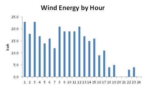
If enough data is available, then estimates of power (the rate of doing work) can  be used to make an estimate of the wind energy passing over the point of observation during a given time period.  The graphs below are are based on a randomly selected location and are an estimate of the wind energy by month, day and hour.

The first graph shows the cumulative wind energy broken down by month, In this example, there is significant seasonal variation, this may vary with climate.  In Western Europe peaks in wind energy often cluster around the equinoxes.  However, in general, there is some correlation between  the periods of peak wind energy and the demand for electricity which also peaks in winter.


Breaking the same dataset down by day shows that wind energy tends to be packaged in pulses a few days apart.


This pattern is present in many sets of observations.  This pattern of supply makes it necessary to have either an element of buffer storage in the system or an alternative that provides an adequate supply of  energy in during the periods of relatively low output.

Many areas have a pattern of diurnal variation, In coastal areas this can be caused by the different      heating/cooling behavior of land and sea with the direction and intensity changing with night and day.


These short term fluctuations emphasise the need for storage or alternative means of generation which can respond quickly to changes in supply and demand.

Solar

The principal variation in solar irradiance comes from Sun-Earth geometry.  The Earth's axis is inclined relative to its orbital plane, in the Northern hemisphere the pole is inclined towards the Sun in summer and away from it in winter and each day the Earth rotates about its own axis. As a result the solar irradiance varies during the day, and seasonal variations are related to latitude.

The graph below shows the estimated clear sky solar irradiance over the course of the day for Southern England (approx. latitude 51 deg. N) at four times of  the year.


In winter, the air mass at solar noon is approx. 4 and the length of day is only eight hours whilst in summer, the air mass at solar noon is close to 1 and the length of the day has extended to 16 hours. At the equator, the air mass at solar noon is always close to 1 and there is little variation in the length of day. Above the Arctic circle (approx. 66.5 deg. N) there are times when the Sun does not rise in winter nor set in Summer.

Superimposed on the variations imposed by planetary motion is the influence of  atmospheric conditions, the most significant of these is the effect of clouds.  Clouds are a feature of climate, itself closely related to latitude. The height and extent graphics below illustrate the variations.  These diagrams are compiled from the height and extent of the cloud cover at solar noon.

The first is for a maritime temperate climate, such as the South of England.


Clouds limit the solar radiation reaching the Earth's surface through a combination of absorption and reflectance.  In general, low, thick overcast cloud such as stratus can attenuate irradiance by more than 80%, whilst the effects of high level cloud such as cirrus may only cause 20% attenuation.  In southern England winters  are characterized by periods of low and very low overcast skies.  In summer the general pattern consists of few, scattered or broken  cumulus, the attenuating effect of these summer clouds is less than those of winter and the overall effect is to cause fluctuations in the output of solar devices.

 A significantly different climate to that of Southern England is that of Arizona, whose height and extent diagram is shown below.


The principal difference is the much lower frequency of occurrence of low level cloud and less seasonal variation.

The effects of planetary motion and cloud cover are combined in the simulation of solar irradiance over Southern England which is shown below:


This graph is based the solar radiation received by a horizontal surface, such as a field.  In most cases the yield of solar devices is increased by tilting them towards the Sun.  Output can be further enhanced by mounting the panels on a tracking device which ensures the panels are always pointing directly at the Sun, however the extra yield must be set against the cost of the  the tracking mechanism.

The graph below shows the effect of cloud on the output of a solar device.  It was compiled from three sets of observations taken around solar noon in June 2011 each with a different cloud extent.


The solar irradiance can vary significantly over a short period of time.  Under a clear sky, the fluctuation in the level of insolation is small and the output is a function of the Earth's rotation about its xis. Similarly, under an overcast sky, the output is more or less constant, but at a much lower level than under a clear sky, in this example, the output is reduced to approximately 10% of the clear sky value. In this case, the scattered cloud was cumulus drifting across the sky at around 4,000 feet obscuring the Sun during for intervals of varying length.. The level of attenuation lies broadly between the clear and overcast skies. The observations for scattered cloud show a phenomenon which might be termed cloud fringe effect, as the edge of the cloud passes over the device, there is an increase in the diffuse irradiation causing the overall level to exceed the clear sky value.

Description of Diagrams


The core of both sets of diagrams is a database of weather and related reports.

  • Cloudbase and Extent -  The diagrams are an attempt to show variation in the nature of cloud cover with climate. The diameter of the circle indicates the frequency of occurrence and those representing cloud cover are pie charts showing the proportion of the extent.   Extent is described using the descriptions  used in Metar reports, e.g.FEW (1 - 2 Octas), SCaTtered (3 - 4 Octas), BroKeN (5-7 Octas) and OVerCast (8 Octas).  Cloud is described as high, if the base is greater than 18,000 feet, low if less than 6,000 feed and very low if it is less than 1,000 feet. Only the highest, most significant layer is used in the computations. It is planned to evolve these diagrams to include more layers, the code was originally intended for use with Western Europe data where the lowest layer is frequently the most significant, however, they do not provide a full picture of the sky in monsoon areas  where the sky can be significantly more complex.
  • Wind - The wind related graphs are based on SQL retrievals from a database of weather reports which were clipboarded into Excel.  Datasets where chosen which had an almost complete set of hourly observations   for a given year.  There are some anomalies in the process, but it is thought that the results give  are reasonable description of the variation in wind speed over time.

Friday, 6 September 2013

Pumped Water Storage

Pumped water systems store energy by increasing the potential energy of a mass of  water by pumping it from a lower reservoir to a higher one, then recovering that energy with a turbine when it flows back down again. The diagram below shows the  main components of a system which acts as a form of battery. During the "charge"  phase electric motors drive pumps which move water from the lower reservoir to the upper one. The energy is recovered when the water flows back to the lower reservoir and passes through turbines which drive "generators".  There are losses associated with the process, the figures quoted in Wikipedia suggest that typical efficiencies are in the range 65 - 85%.
The basic equation which describes the systems storage capacity is shown below.  The simplicity of the equation is in contrast to the construction of these of system which are often massive civil engineering projects.
The key term is the product of V and H.  For utility scale projects, the volume V is typically of the order of millions of cubic metres whilst the height, is tens or hundreds of metres.  The density of water rho is constant of at 1,000 kg/m3.  The acceleration due to gravity is also a constant at 9.81 m/s2 and the efficiency eta is a fraction less than one.  The efficiency of the Dinorwig plant in North Wales is thought to be around 75%. Q is the energy stored in Joules (1 kwh represents 3.6 MJ).

A typical urban water tower with a height of 30 metres and a storage volume of 1,000 m3 if used as a  pumped water storage system would have a capacity of approximately 50 kwh, assuming an efficiency of 60%.  However, major installations such as Dinorwig have sufficient capacity to provide some grid management capability by using electricity during off-peak periods to fill the upper reservoir and provide 1 to 3 GW of generating capacity during peak demand.

Pumped water is the principal grid scale storage technology.  The energy storage density is low, in the water tower example used above, the density is 20 tonnes/kwh. For small scale systems, the cost could exceed £1,000/kwh, these figures are high compared to lead/acid  batteries which might cost around £250/kwh for a similar sized system.  The main strength of pumped water is that very large quantities of energy that can be stored, much more than is possible with the various battery technologies.  Pumped storage systems are major civil engineering projects, some are based on disused quarries, others on large dams and disused mine workings are being considered for conversion. Existing systems have generating capacities similar to those of small to medium sized power stations, the buffer capacity for most grid systems is measured in hours rather
than days.

Links to other sources


Sunday, 1 September 2013

Laundry

One of the side effects of installing rooftop PV is a desire to balance generation and consumption. I know of one father who is frustrated by his daughter's use of hair straighteners.  A recent piece in "The Guardian" told of a couple who were surprised by the amount of energy used by a tumble dryer.  Proof of the doctrine of unexpected consequences is that working from home results in swapping the daily commute for domestic chores.  In an attempt to turn laundry into environmental science, I sometimes weigh the washing before hanging it out to dry and then once again when it is it back in the house.  The results of a year's bizarre behaviour are shown in the graph below:


Over the year, the average water removal is 1.5 kg/wash.  By making some assumptions about the efficiency of tumble driers, this approximates to the equivalent of 600 kwh/year, which might account for say 10 - 20% of the average household electricity consumption of 3,500 kwh/year.

Several houses in our road put their underwear on public display a couple of times each week. but there was a time when most households had a washing line and a prop to keep sheets of the ground.  To authenticate this statement, consult the works Shirley Hughes, a favourite author of bedtime stories for many children.

In the newspaper supplements which attempt to promote "eco" living, you will find adverts for rooftop solar water heaters (useful for six to eight months each year) costing around £3,000, ground source heat pumps for even larger amounts, but with the lure of RHI payments.  Washing lines and whirligigs seldom figure in these publications.  We are fortunate in having a conveniently placed railing, but if we installed a proper south facing washing line, the cost might be £100 for poles and concrete foundations, this would be an investment which would pay back in a couple of years.  Laundry is not a sexy subject, even for environmental journalists, so can the lifestyle gurus make laundry fashionable, reduce emissions and boost energy security?

Conservation is difficult for politicians, our present government has attempted to be "the greenest government ever", but it is easier to encourage wind turbines than washing lines.  Does 10 Downing Street have a whirligig?


Friday, 16 August 2013

Urban Wind

Munn's third law states that any place you can wear a kilt or a skirt without embarrassment might not be a great place to put a wind turbine.  With this in mind, I spent a few mornings cycling round a seaside town with a simple wind speed meter in an attempt to get an understanding of urban wind.

Until recently the most common source of wind speed data was weather reports from airfields. These are large open spaces and the weather station is usually located somewhere close to the point of touchdown where its data will make the greatest contribution to aircraft safety.  This is in contrast to most residential and commercial areas which are cluttered with buildings, trees and infrastructure such a bridges all of which might be crammed into hillsides and valleys. In the past few years, data from small weather stations mounted in backyards has become available.  The two sources give different impressions, typically, airfields have a average annual wind speed in roughly in the range 4 - 7 m/s, whilst backyards might experience 1 - 4 m/s.  As with all gross generalisations, there are exceptions, but my own backyard sitting on the sheltered side probably has an average of around 1 m/s based on many calm days and a few gusty ones.

Wind speed measurements are typically taken at a standard height of 10m although there are some important exceptions, for offshore buoys it is often 4 - 5 m, for offshore platforms it can be well over 100m (to assist helicopter operations).  Private weather stations can be at any height available to the owner. However, they are generally located at the base of the boundary layer which is not an ideal place to put a wind turbine.  Utility scale machines are mounted on towers, typically 100 metre tall which lift the rotor out of the turbulent and complex air flows found around roof and tree tops.  The photo shows a medium sized wind turbine mounted on a tall tower in an urban location:


However, this type of structure is not practical/acceptable in the average backyard, so wind found at approximately 10 metres is the the resource that is available to most people (subject to neighbours, town planning and building regulations which keep towns and cities safe and relations between residents harmonious).

The plan was to cycle around the town taking wind speed measurements at a variety of locations and compare them to data from a small airfield a few km to the west.  In a failed attempt to introduce an element of street theatre I took a small model of a Savonius wind turbine with me.


Whatever other merits it may possess, the Savonius design can withstand the rough handling that comes from being strapped to the back of a bike.

During seven outings I found about 20 locations where I could take measurements.  With the single exception of a curious dog, this bizarre activity attracted no attention.  The locations included the seafront and a breakwater, the roofs of multi-story car parks and my own backyard.  One days results are shown in graphic form below:

Moderate winds at the airfield are usually smooth and there is a good relationship between the wind there and that experienced on the sea front.  In these places the Savonius model would spin continuously when the wind was greater than 3 m/s.  However, in the town, suburbs and parks the wind was usually attenuated and turbulent, the graphic is a sketch of the relationship between "clear" and "urban" wind:

The rooves of car parks were the most interesting, all five locations were well above surrounding roof tops, yet in all cases, the wind was turbulent and it was rare for the Savonius model to spin continuously.  Having seen several horizontal axis wind turbines in urban locations they often appear to "hunt" for the wind then spin up and down with the gusts.  The vertical axis Savonius was usually quick to respond to gusts, however, the coefficient of performance is low.  The coefficient of performance is the fraction of the wind's energy that the turbine manages to extract.

The relationship between wind speed and power is cubic, thus a 5 m/s wind has almost five times the energy of one of 3 m/s, the relationship is complicated by variations in a turbine's coefficient to performance with wind speed.  In general, the coefficient of performance declines with increasing turbulence.

It is probable that a suburban area with low and widely spaced housing on flat land might give more encouraging results, but in a densely populated English town, small wind turbines have limited potential for generating significant amounts of energy.  The greatest potential for wind energy appears to be large turbines located offshore where average annual wind speeds are significantly higher than those onshore.  However, offshore wind is still a weather/climate dependent energy source.


Friday, 9 August 2013

Negawatts vs, Megawatts

There are two ways to reduce emissions and increase energy  security.  The first is to use less energy and the second is to generate it from renewable sources.  The two approaches are not mutually exclusive and both are desirable but they compete for resources.  Around 2006, I became interested in renewable energy, up to that point, I had not thought too much about consumption and at that time electricity was reasonably priced.  Typical grid-tied, rooftop PV installations produce between 1,500 and 2,500 kwh/year.  A good starting point was to try reduce our consumption to the level at which a form of self-sufficiency could be attained.

Alongside my interest in renewable energy, is a belief that investments which are good for the environment, should also be good for me.  Added to this is the belief that sound investments are based on fundamentals (e.g. fuel savings) and should not be driven by tax regimes or subsidies, In other words, I'm prepared to buy an item which reduces my emissions, but I want to be rewarded in the form of lower energy bills.  For energy consumption, and therefore emissions to fall, there should be a "virtuous circle" by which I use less energy and I am better off as a result.  This should be possible to achieve, energy is now expensive.

Whilst I am fascinated by solar devices and wind turbines, conservation was consistent with my opinions (my favourite coffee mug has the slogan - "everyone's entitled to my opinions").  The graph below shows our household's estimated electricity consumption since 2005:


When we started there were some quick wins, incandescent lamps were replaced by CFLs and old computers which were better room heaters than number crunchers were replaced by laptops.  The gas driven domestic hot water system was an economic mess consisting of a gravity feed system with an efficiency of 20% (a charitable estimate).  This took an average to two hours to create a warm bath, therefore anyone needing to be clean used the immersion heater (cheap at night, but expensive during the day).  The water heating was upgraded to a pumped system which also reduced the gas bill and did not leak.  Rough estimates of the breakdown of consumption "before" and "after" are shown below.


Since 2007, consumption has drifted down to an average of 6 kwh/day, mainly as a result of taking account of energy efficiency as things like fridge have had to be replaced and just being aware of our energy consumption.  We are not wandering around in Stygian darkness obsessed by energy bill dropping through the letterbox.

The law of diminishing returns is beginning to assert itself, we are starting to replace CFL lamps with LED ones which may take us down to 4 kwh/day over the next one or two years.  Our electricity consumption will probably be in the range 1,000 to 1,500 kwh/year, which compares well with the national average of around 3,500 kwh/year (comparing averages is always dangerous).

It has to be said that a wind turbine in the back yard would be fun but as I have embarrassed myself on countless occasions by wandering around the garden with a wind speed meter consistently reading 0 m/s and have no desire to annoy my neighbors, this is not going to happen.  The sun does not shine at night and rarely during winter, so rooftop PV does not appeal.  So, I will press on with the LED lights.

Sadly, conservation is not sexy.  Acquaintances with rooftop PV who have seen me cycling around with a model wind turbine strapped to my back ask me why my south facing roof is empty and an unscientific survey of the environmental pages of the papers (read on my phone) suggests that greater coverage is given to wind farms than to things lurking in cupboards like boilers, heating controls and meters.  A knowledge of the capabilities of smartphones is a sign of virility whilst being able to read gas and electricity meters is considered boring.  Typically, a mobile phone bill is in the range £15 - £30/month, whilst energy bills often exceed £100/month, so there is an incentive to take an interest.

The scale of investment is also an issue, I have the occasional outing to an "eco" fair where a high proportion of the offerings are green boxes with a price tags well over £1,000.  This is not the sort of money that fits well into a typical family budget, yet £10 for an LED light or a few quid extra for a more efficient fridge or washing machine can make a difference over time.

Policies which focus on conservation are difficult for politicians, offering subsidies for generation projects gives an incentive to do something.  Telling people not to do something, i.e. use energy is creates a range of reactions ranging from indifference to to charges of infringing of civil liberties:.


Its better to make a good case for energy efficient lighting than embarking on legislation which does not win hearts and minds.  Had we not adopted CFL's are electricity bill would now be approaching £100/month.

The link between environmental benefits and high cost objects also seems to be well established in (some) political thought processes.  During the 2010 election I was accosted by a canvasser keen to establish the environmental credentials of their chosen candidate, in the interests of fairness, it is probable that I was being a pain at the time, but the patter went along the lines "Of course she can't afford a Hybrid Car". My understanding of hybrid vehicles is that by combining a petrol/diesel engine, motor/generator and a battery you can make a fairly efficient vehicle for £27,000, however, some conventional vehicles, often described as "dull" by reviewers, offer similar performance for much less.  Other options include a small car, no car and a bicycle.  If you live in a remote rural area, you need a car, if you live in a city, a bicycle makes sense economically and environmentally, that also seems to be the view of the current Mayor of London, the man behind the Boris Bike.

Next week - Urban Wind


Friday, 2 August 2013

Soil Temperature

Last year, I became curious to know why there was such a wide variation in the time to germination of seeds (mainly beetroot).  Sowing things at the earliest date suggested by the directions on the packet seemed like a good way to maximise yields, however, some seeds took a month to germinate with a low success rate, whilst the same variety planted in late July germinated quickly with a high success rate.  One explanation was variation in soil temperature, even in England, the ground is warmer in July than it is in March.  To try and understand what was happening, I started measuring soil temperatures approximately an hour before sunset on Sunday evenings.  This post is a celebration of a year's data collection and the politeness of my neighbours.

This web page is periodically updated with data as it becomes available:

Brighton Webs - Soil Temperature

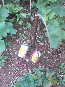
The first step was to sink a length of copper pipe into the ground, the only consideration about its location was the hope that the house's water supply was located somewhere else.  The base of the pipe extends a few centimetres into the chalk which is the dominant feature of the landscape in these parts.


Temperature measurements are taken by lowering a 4.7k thermistor mounted on the end of a 2 metre length of neoprene tubing.  A baffle on the end of the tube is meant to limit the movement of air in the hole to ensure that the measurement is related to the pipe, not the air within it.  The resistance of the thermistor is taken with a basic and much abused multimeter.


The photo shows the equipment in use, data logging is done with a pencil and paper.

The results to date are plotted on the graph below together with the average air temperature for Brighton.

The graph clearly shows the wide variations in temperature experienced by the topsoil.  In winter radiative cooling on a clear night can take the topsoil temperature several degrees below the air temperature whilst a hot sunny day with a clear sky can raise it several degrees above it.  The thermal environment of vegetables is much more turbulent than one would suppose from simply looking at the air temperature from a weather report.  Some gardeners will have experienced the damage done by overnight frost and discovered this on a warm spring morning.

In contrast to the topsoil, the subsoil temperature closely follows the average air temperature.  The relationship between the topsoil and subsoil temperatures is interesting, when the ground is cooling after the Summer Solstice, the subsoil is warmer than the topsoil.  After the winter solstice, the subsoil takes a few weeks to start warming.  It is as though the subsoil is acting like a storage heater, keeping the soil warm as Autumn and Winter approach.  I was intrigued by this, the graph below shows a simulation of the solar irradiance received by the earth's surface and the average air temperature.  Solar irradiance peaks at the Summer Solstice in June and is at a minimum at the Winter Solstice in December, yet the warmest month is July and the coldest one is January
Whilst solar insolation and radiative cooling account for a large part of the temperature variation experienced by the topsoil, advection is also significant.  From January to April 2012, cold air masses moved across the Channel from Continental Europe, these acted to suppress the soil temperate, making it difficult for seeds to germinate, it was May before the topsoil temperature got above 10 deg. C.

Climate classification schemes as Koppen are based on the concept that native plants have adapted to the prevailing temperature and rainfall.  In 1954 Dorothy Hartley published "Food in England", this was before the worldwide movement of fruit and vegetables.  In the 1950s, market gardens could found on the edges of big town, also many people had been involved in part time vegetable cultivation during the war and had continued to do so in their back gardens.  Some of the varieties described by Harley had been bought to England form overseas, the best known example being the potato which is thought to have originated some around Peru or Bolivia, but all of them had been grown here for at least a hundred years.  A common characteristic of most of the plants grown from seed is that they will germinate in temperatures of less than 10 deg. C..