Pages

Friday, 8 November 2013

Soil Temperatures - Update

This is an update of a post published on 02-Aug-2013 which describes the hole in the ground used to collect soil temperatures.  I now have just over a little more than one year's data which makes it possible to look for patterns in the data and do a year-on-year comparison.  I started this project in August 2012 just as the ground was starting to cool after the summer.  The full data set is shown below:
The same general patter is present in the Autumn of 2013 as it was in 2012 with the topsoil cooling more quickly than the sub soil.  The maximum values of topsoil temperature were observed in July when there were several weeks of clear sky when the Sun was high in the sky.  The lows were towards then end of long winter when it was April before Earth and Englishman felt warm in the garden.
So far, weather at the end of Autumn has been milder than in 2012 and the subsoil temperatures are two to three degrees higher than last year.  The topsoil more or less follows the air temperature but, it's variation is increased by radiative heating and cooling can lead to loss or moisture and frost respectively.
The observations from the last month illustrate the complexity of the heating and cooling processes.  During the weekend of 13-Oct,  average air temperatures had fallen to below 10 deg. C (cold air from mainland Europe?) and the topsoil temperature fell below that of the subsoil.  A week later, average air temperature rose to more than 15 degrees (warm air from the Atlantic?) and the situation was reversed, the topsoil was warmer than the subsoil.  In addition to air movements (note to self, try and look at a weather map each day and see what's happening), there would also have been radiative cooling and heating.

After a year, the ritual of poking a wire down a hole in the back yard at dusk on Sundays is well established, data on this web page is periodically updated:

Brighton Webs - Soil Temperature

Friday, 25 October 2013

Energy Storage and Vegas Values

Energy storage is the buffer between supply and demand.  Wind and solar sources are weather dependent systems whilst home and work life tends to follow a more or less predictable routine.  Whilst the ancient mariner or miller might have taken a duvet day when the wind was not blowing, the office worker is expected to be at his/her desk when the weather outside is fair or foul.  Storage is a key component in renewable energy systems.

Monte Carlo simulation is one way to explore the interaction between supply, demand and storage.  The concept is simple, you throw random events as a mathematical model and see how it behaves, whilst this may sound abstract, its more than a bit like real life.  The name was comes from the roulette wheels in the casinos of Monte Carlo in the 19th century, in a fair and decent world, these devices are true random number generators.  If the technique was being named today, it might be called Vegas Values.

The example is based on a simplistic model of a system with three components, a small wind turbine, battery storage and a load. The example has been set up such that the average supply and demand are both 1 kwh.day, however, the distribution of  the supply and demand are different, and it is probable that on any given day, supply and demand will not balance. There could be large demand for energy on a calm day or little demand on a windy one. The inclusion of storage in the form of a battery helps match supply and demand. In this example, we want to understand the effect on system reliability for different amounts of storage.


Over a given 30 day month, the wind turbine produces an average of 1 kwh/day, this supply is assumed to be a triangular distribution with a minimum of 0, a  mode of 0.5 and maximum of 2.5 kwh. This supplies a 100% efficient battery, the capacity of which subject of the simulation. The model was run with storage capacities ranging from zero (no storage) to 10 kwh. The load is also 1 kwh/day and also modelled as a triangular distribution, the minimum, mode and maximum values are 0.5,1.0 and 1.5 respectively. The system "fails"; when the battery cannot supply the load. The parameter of interest is the number of days per month the system fails, which can also be expressed at the probability of the system not failing during the month.

The core of the model is shown in the flow chart:


This is a very simplistic model, so a single function is used to return a triangularly distributed random number, the arguments being the minimum, mode and maximum values. The Python code for this simulation can be found on our website. The principal variable is "storagesize" which is the capacity of the battery in kwh. The output of the program was used to create the graph below.

This simplistic model of a hypothetical system suggests that increasing storage reduces the probability of system failure but at the amount of storage increases, the law of diminishing returns set in.

Related Material

Monte Carlo Simulation

Triangular Distribution

Saturday, 12 October 2013

The Clear Sky

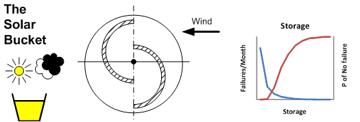
The starting point was a statement of the obvious.  Clouds affect the performance of solar energy systems and this can be summarised as "clear sky, good"  and "overcast sky: bad".  The problem was how to quantify this, a convenient descriptor is something that might be called the clear sky factor (reduced to CSF) which is defined as:
For this concept to be useful it is necessary to have a definition and an estimate of the clear sky irradiance.  There are well developed models which can provide good estimates of clear sky irradiance, but they require some knowledge of the state of the atmosphere, whilst such data is provided by satellites such as Ceres and weather balloons, it can be hard to relate this data to a casual observation.  Another approach is to use a correlation for a given location, a good example of this is the work the Meinels in the Mojave Desert in the 1960s.

Comment

This is a discussion of work in progress and is a development of a previous post on the diffuse fraction and should be treated with similar caution.

Correlation

The Meinel's formula produces an estimate of direct normal irradiance for a given value of air mass:


The solar constant is approximately 1370 watts/m2, it varies during the year due to the elliptical nature of the Earth's orbit around the Sun.  The form of the equation is well suited to its application and whilst I was defeated in an attempt to work out the least squares equation, it is possible work with it using the Solver add-in for MS Excel.

I had found that a crude piece of equipment (described in the post on diffuse fraction) can provide an insight into the way irradiance changes with the state of the sky.  I became curious to know if the data collected by this device could be used to provide a correlation in the form of the Meinel formula which reflects the local climate and possibly produce an estimate of diffuse irradiance.


Clear skies are rare in England, out of approximately 100 observations, only a few were taken under a completely cloudless sky.  Typically the day will start clear, but by noon, some clouds will have formed.  Whilst the equipment is simple, the method of operation does ensure you observe the sky and this provides partial compensation for the lack of sophistication.

First Attempt

The equipment provides an estimate of global horizontal and diffuse horizontal irradiance and if the time of the observation is recorded correctly, the zenith angle can be calculated from Sun-Earth geometry and this in turn can be used to calculate the plane parallel air mass.  A combination of these bits of information provides an estimate of the direct normal irradiance:


A plot of the result to date is shown below:

The graph shows two things, the first is wide spread in the range of values for DNI for a given air mass.  Most of the low values were observed when there was some cloud present in the sky, even though the sky was clear in the direction of the Sun, quite often whilst the sky appeared to be clear, satellite images suggest that there was some cirrus present within a few kilometres.  A secondary objective was to compare my description of the sky with those from metar reports from a nearby airfield, in general, there was reasonable agreement on the extent of cover (I do not attempt to estimate height).  Many airfields only report low level cloud because that has the greatest influence on aircraft movements, thus a report which suggests a clear sky does not take into account any high level cloud which has the effect of increasing diffuse irradiance and increasing the diffuse fraction.  Secondly, the upper limits of direct normal irradiance with low values of diffuse fraction were close to the values predicted by the Meinel formula.  As the diffuse fraction increases with air mass, some selection of data points, possibly using satellite images as a guide, might yield some clear sky data points at high air masses.

At the time of writing, there is not enough data to attempt a correlation, but the work to date suggests that one may be possible.

Diffuse Fraction

Whist making these observations is pleasant task involving walking or cycling in the sunshine, it can be frustrating when the data yield is small, especially at the start or end of the day. The graph below shows the temperature, dew point, diffuse fraction and sky state for the 01-May of this year.


Around nine, in the morning, the sky appeared to be hazy, but clear, as the morning progressed a few small cumulus clouds passed across the sky, it was only around noon, that the sky was "clear".


Friday, 27 September 2013

The wind, my mobile and the Space Shuttle

Last week's post was about the fluctuations in wind and solar with time.  The week is an attempt to understand how wind speed varies with location.  What might be called a reference for wind speed in our area is the METAR reports from an airfield approximately 10 km to the west, Most of the time, this is upper limit of the wind speed which will be found in the wider town and country where the variations are significant. This is can be seen in the observations from personal weather stations on the Weather Underground, these are a valuable source of data, but as many of them are located in urban areas it is difficult to separate out the effects of terrain from rooftops.

The research plan was simple, go for a walk in the countryside with a wind speed meter and record the location of the readings using the GPS on my mobile phone.  As an aside, if you want perfect isolation from your fellow man, simply wander around with a clipboard and a measuring device and no one will come near you, this also works with sheep.  After several days locked in mortal combat with VB.net I managed to plot the results of the expedition on Google Earth together with contours derived from data made available from the Space Shuttle's SRTM mission.  I would like to express my appreciation of the openness of NASA and NOAA for placing fascinating datasets in the public domain, apart from hikes and cycle rides most of my knowledge of renewable energy comes from studying this material.

The results of the first attempt are shown in the screenshot from Google Earth:


The colour gradient chosen for the contours makes the valleys yellowish and the ridges reddish.  The numbers by the placemarks are the ratio of the observed wind speed to that of the nearest source of METAR reports.  On this occasion, the wind was blowing more or less steadily at 5 m/s from the south west.

The direction of travel was from South to North.  The first couple of kilometres were along a main road through an urban area where trees were rustling, but the wind speed meter was not registering, thus the wind speed was probably less than 2.5 m/s.    The next stage was along a ridge leading to the crest of The Downs, the start of this was sheltered wna the wind was approximately 4 m/s and turbulent, however, once on crest of the ridge the wind was steady at around 5 m/s.  The route had been chosen to include an descent into a valley through which runs a four lane highway but which is crossed a convenient bridge where a track goes up the eastern side.  During this stretch, the trees were rustling, but the wind speed meter was lifeless.  Once on the crest of The Downs, the wind was back to 5 m/s.  Carrying on to the North takes you down a steep scarp leasing to the relatively smooth Low Weald where only a gentle breeze was experienced.

Whilst this approach is simplistic, it does provide an insight into the relationship between wind speed and terrain.  I will test the tolerance of the local sheep population with some more hikes.


Friday, 20 September 2013

The Fickle Wind and Shifting Sun

The energy input to wind and solar devices

Wind turbines and solar panels are energy conversion devices.  The input to these systems is not constant, it changes with the seasons, the weather and the time of day.

Comment 
   
This work has not been reviewed, thus it should be treated as a discussion not a description.

Wind

Wind is the result of uneven heating of the Earth's surface, in addition to climate, the airflow over any given location will be influenced by terrain. There can be significant variation in the wind experienced by places only a few kilometres apart. Whilst wind is often described in terms of velocity and direction of travel, it can be useful to consider it in terms of  power. The wind power available for conversion by a turbine is related to the cube of its velocity.

Power = area * density * velocity/ 2

A small increase in wind speed represents a large increase in energy, for example wind blowing  at 8 m/s has more than twice the energy than at 6 m/s.

By setting the area equal to 1 square metre and approximating the density of air to 1.2 kg/m3 and  converting the units to kw, the formula reduces to:

Power = 1.2 * Velocity3 / 2000

Comparisons based on this formula should be treated with caution. The density of  air falls with increasing altitude, for example it is close to 1.0 around 1,500m. The height of the observation above ground also has an influence, for a few  hundred metres above the surface, the wind speed increases with height above ground as the effect of friction reduces. The power of a wind turbine is substantially less the value given by this formula as only a fraction of the energy is extracted.  The fraction of the energy extracted at any given time is known as the  coefficient of performance, typically this is in the range 0.1 to 0.4 and may vary according to the wind speed.

If enough data is available, then estimates of power (the rate of doing work) can  be used to make an estimate of the wind energy passing over the point of observation during a given time period.  The graphs below are are based on a randomly selected location and are an estimate of the wind energy by month, day and hour.

The first graph shows the cumulative wind energy broken down by month, In this example, there is significant seasonal variation, this may vary with climate.  In Western Europe peaks in wind energy often cluster around the equinoxes.  However, in general, there is some correlation between  the periods of peak wind energy and the demand for electricity which also peaks in winter.


Breaking the same dataset down by day shows that wind energy tends to be packaged in pulses a few days apart.


This pattern is present in many sets of observations.  This pattern of supply makes it necessary to have either an element of buffer storage in the system or an alternative that provides an adequate supply of  energy in during the periods of relatively low output.

Many areas have a pattern of diurnal variation, In coastal areas this can be caused by the different      heating/cooling behavior of land and sea with the direction and intensity changing with night and day.


These short term fluctuations emphasise the need for storage or alternative means of generation which can respond quickly to changes in supply and demand.

Solar

The principal variation in solar irradiance comes from Sun-Earth geometry.  The Earth's axis is inclined relative to its orbital plane, in the Northern hemisphere the pole is inclined towards the Sun in summer and away from it in winter and each day the Earth rotates about its own axis. As a result the solar irradiance varies during the day, and seasonal variations are related to latitude.

The graph below shows the estimated clear sky solar irradiance over the course of the day for Southern England (approx. latitude 51 deg. N) at four times of  the year.


In winter, the air mass at solar noon is approx. 4 and the length of day is only eight hours whilst in summer, the air mass at solar noon is close to 1 and the length of the day has extended to 16 hours. At the equator, the air mass at solar noon is always close to 1 and there is little variation in the length of day. Above the Arctic circle (approx. 66.5 deg. N) there are times when the Sun does not rise in winter nor set in Summer.

Superimposed on the variations imposed by planetary motion is the influence of  atmospheric conditions, the most significant of these is the effect of clouds.  Clouds are a feature of climate, itself closely related to latitude. The height and extent graphics below illustrate the variations.  These diagrams are compiled from the height and extent of the cloud cover at solar noon.

The first is for a maritime temperate climate, such as the South of England.


Clouds limit the solar radiation reaching the Earth's surface through a combination of absorption and reflectance.  In general, low, thick overcast cloud such as stratus can attenuate irradiance by more than 80%, whilst the effects of high level cloud such as cirrus may only cause 20% attenuation.  In southern England winters  are characterized by periods of low and very low overcast skies.  In summer the general pattern consists of few, scattered or broken  cumulus, the attenuating effect of these summer clouds is less than those of winter and the overall effect is to cause fluctuations in the output of solar devices.

 A significantly different climate to that of Southern England is that of Arizona, whose height and extent diagram is shown below.


The principal difference is the much lower frequency of occurrence of low level cloud and less seasonal variation.

The effects of planetary motion and cloud cover are combined in the simulation of solar irradiance over Southern England which is shown below:


This graph is based the solar radiation received by a horizontal surface, such as a field.  In most cases the yield of solar devices is increased by tilting them towards the Sun.  Output can be further enhanced by mounting the panels on a tracking device which ensures the panels are always pointing directly at the Sun, however the extra yield must be set against the cost of the  the tracking mechanism.

The graph below shows the effect of cloud on the output of a solar device.  It was compiled from three sets of observations taken around solar noon in June 2011 each with a different cloud extent.


The solar irradiance can vary significantly over a short period of time.  Under a clear sky, the fluctuation in the level of insolation is small and the output is a function of the Earth's rotation about its xis. Similarly, under an overcast sky, the output is more or less constant, but at a much lower level than under a clear sky, in this example, the output is reduced to approximately 10% of the clear sky value. In this case, the scattered cloud was cumulus drifting across the sky at around 4,000 feet obscuring the Sun during for intervals of varying length.. The level of attenuation lies broadly between the clear and overcast skies. The observations for scattered cloud show a phenomenon which might be termed cloud fringe effect, as the edge of the cloud passes over the device, there is an increase in the diffuse irradiation causing the overall level to exceed the clear sky value.

Description of Diagrams


The core of both sets of diagrams is a database of weather and related reports.

  • Cloudbase and Extent The diagrams are an attempt to show variation in the nature of cloud cover with climate. The diameter of the circle indicates the frequency of occurrence and those representing cloud cover are pie charts showing the proportion of the extent.   Extent is described using the descriptions  used in Metar reports, e.g.FEW (1 - 2 Octas), SCaTtered (3 - 4 Octas), BroKeN (5-7 Octas) and OVerCast (8 Octas).  Cloud is described as high, if the base is greater than 18,000 feet, low if less than 6,000 feed and very low if it is less than 1,000 feet. Only the highest, most significant layer is used in the computations. It is planned to evolve these diagrams to include more layers, the code was originally intended for use with Western Europe data where the lowest layer is frequently the most significant, however, they do not provide a full picture of the sky in monsoon areas  where the sky can be significantly more complex.
  • WindThe wind related graphs are based on SQL retrievals from a database of weather reports which were clipboarded into Excel.  Datasets where chosen which had an almost complete set of hourly observations   for a given year.  There are some anomalies in the process, but it is thought that the results give  are reasonable description of the variation in wind speed over time.

Friday, 6 September 2013

Pumped Water Storage

Pumped water systems store energy by increasing the potential energy of a mass of  water by pumping it from a lower reservoir to a higher one, then recovering that energy with a turbine when it flows back down again. The diagram below shows the  main components of a system which acts as a form of battery. During the "charge"  phase electric motors drive pumps which move water from the lower reservoir to the upper one. The energy is recovered when the water flows back to the lower reservoir and passes through turbines which drive "generators".  There are losses associated with the process, the figures quoted in Wikipedia suggest that typical efficiencies are in the range 65 - 85%.
The basic equation which describes the systems storage capacity is shown below.  The simplicity of the equation is in contrast to the construction of these of system which are often massive civil engineering projects.
The key term is the product of V and H.  For utility scale projects, the volume V is typically of the order of millions of cubic metres whilst the height, is tens or hundreds of metres.  The density of water rho is constant of at 1,000 kg/m3.  The acceleration due to gravity is also a constant at 9.81 m/s2 and the efficiency eta is a fraction less than one.  The efficiency of the Dinorwig plant in North Wales is thought to be around 75%. Q is the energy stored in Joules (1 kwh represents 3.6 MJ).

A typical urban water tower with a height of 30 metres and a storage volume of 1,000 m3 if used as a  pumped water storage system would have a capacity of approximately 50 kwh, assuming an efficiency of 60%.  However, major installations such as Dinorwig have sufficient capacity to provide some grid management capability by using electricity during off-peak periods to fill the upper reservoir and provide 1 to 3 GW of generating capacity during peak demand.

Pumped water is the principal grid scale storage technology.  The energy storage density is low, in the water tower example used above, the density is 20 tonnes/kwh. For small scale systems, the cost could exceed £1,000/kwh, these figures are high compared to lead/acid  batteries which might cost around £250/kwh for a similar sized system.  The main strength of pumped water is that very large quantities of energy that can be stored, much more than is possible with the various battery technologies.  Pumped storage systems are major civil engineering projects, some are based on disused quarries, others on large dams and disused mine workings are being considered for conversion. Existing systems have generating capacities similar to those of small to medium sized power stations, the buffer capacity for most grid systems is measured in hours rather
than days.

Links to other sources


Sunday, 1 September 2013

Laundry

One of the side effects of installing rooftop PV is a desire to balance generation and consumption. I know of one father who is frustrated by his daughter's use of hair straighteners.  A recent piece in "The Guardian" told of a couple who were surprised by the amount of energy used by a tumble dryer.  Proof of the doctrine of unexpected consequences is that working from home results in swapping the daily commute for domestic chores.  In an attempt to turn laundry into environmental science, I sometimes weigh the washing before hanging it out to dry and then once again when it is it back in the house.  The results of a year's bizarre behaviour are shown in the graph below:


Over the year, the average water removal is 1.5 kg/wash.  By making some assumptions about the efficiency of tumble driers, this approximates to the equivalent of 600 kwh/year, which might account for say 10 - 20% of the average household electricity consumption of 3,500 kwh/year.

Several houses in our road put their underwear on public display a couple of times each week. but there was a time when most households had a washing line and a prop to keep sheets of the ground.  To authenticate this statement, consult the works Shirley Hughes, a favourite author of bedtime stories for many children.

In the newspaper supplements which attempt to promote "eco" living, you will find adverts for rooftop solar water heaters (useful for six to eight months each year) costing around £3,000, ground source heat pumps for even larger amounts, but with the lure of RHI payments.  Washing lines and whirligigs seldom figure in these publications.  We are fortunate in having a conveniently placed railing, but if we installed a proper south facing washing line, the cost might be £100 for poles and concrete foundations, this would be an investment which would pay back in a couple of years.  Laundry is not a sexy subject, even for environmental journalists, so can the lifestyle gurus make laundry fashionable, reduce emissions and boost energy security?

Conservation is difficult for politicians, our present government has attempted to be "the greenest government ever", but it is easier to encourage wind turbines than washing lines.  Does 10 Downing Street have a whirligig?