Pages

Friday, 26 February 2016

Messing with model wind turbines

If there is a theme to these posts, it is learning about sustainable energy.  Staring at a wind farm or an array of solar panels can be instructive, but some personal experience is always useful, even with the limitations imposed by small models.  These two models were made with materials which were lying around where were a length of drain pipe, some plywood offcuts and a random selection of Meccano.  If I ever repeat this exercise, I would opt for a lighter construction and a small alternator as a load.  An attempt at making a dynamometer was not wholly successful.

Wind in urban and rural areas is often turbulent and gusty with frequent changes of direction.  There are a few small horizontal wind turbines in our area, the only ones which give the impression of running continuously when the wind is blowing are those mounted on tall masts.  One of the attraction of vertical axis turbines is that the can adapt to frequent changes in wind direction without having to "hunt" for the wind, another is they are quite simple machines.  Many Savonius turbines used in the Caribbean to drive irrigation pumps are just a 40 gallon oil drum which has cut in two along and welded back together.  I am not fully convinced that rotating machinery has a place in the urban environment, however, the Savonius design  has some inherent speed limitation.  For these reasons I opted to mess with vertical axis designs.


The advantage of models is that they can be moved around on a bicycle and tried in various locations.  Despite mounting the Savonius model on a 5 metre pole, it never turned continuously in my back yard whatever the wind was doing elsewhere, that was a useful lesson.  About 7km to the west of where I live is a small airfield where the remains of some of the Second World War defences are accessible.  The roof of a pillbox which had been build on an embankment is about 10m higher then the surrounding flat terrain, here the Savonius model spun freely and smoothly.  The wind there is both smooth and steady.  In contrast, performance on the upper level of multi-story car parks in the city centre was disappointing, the turbine would spin during gusts, then stay sullenly stationary for at least 30 seconds before starting up again.  Performance on jetties along the sea front was good if the wind was blowing of the sea and poor if it was coming from the land.  I did not investigate too closely, but the wind at the top of cliffs appeared to be complex, I may have formed a different opinion if the turbine had been on mast rather than at head height.  It is important to be careful in public places.

I had no desire to draw attention to myself, but with the exception of a large Alsatian called Trooper I was allowed to engage in this bizarre activity without interference.

I had been intrigued by the Darrius design of turbine, however, the model refused to do anything useful, which with hindsight is probably a good thing.  The most probable cause was poor construction which did not allow for setting an appropriate angle of incidence on the vertical blades.  An afternoon spent figuring out the aerodynamics of this type of machine was useful.

Whilst this design looks simple, the aerodynamics and resulting stresses are complex, had the thing worked, it would have probably shaken itself to bits.  I'm not certain of my facts, but I think that this design is capable of over-speeding under no-load conditions.


I became somewhat more absorbed in this project than I intended and when time permits I want to build another Savonius model.  If I proceed with a second attempt, the design will incorporate a small alternator to act as a load and provide some indication of output.  The first attempt used a fluid clutch attached to a torsion spring, this was a good illustration of the rule which says "if it looks complicated, it's probably wrong".  Secondly, the rotor would consist of three segments each 120 degrees apart, this would smooth the output torque and prevent the rotor getting "stuck".  Most of the time the Savonius was self-starting, but occasionally act like a weather vane until given a sharp prod with a finger.  I have seen some beautiful picture of Savonius turbines where rotor is a spiral which suggests the possibility of making a turbine into a garden feature.

Both models are being dismantled for firewood and the recovery of the Meccano bits.


Saturday, 20 February 2016

Economics, LED Lighting and Sustainability

Economics and sustainability do not sit comfortably together.  Fossil fuels are convenient and after more than a century of development the devices which consume them are reasonably efficient and in some respects cheap.

Things that are tagged as "sustainable" or "green" often have a premium either paid directly by the owner or indirectly by a third party in the form of a subsidy.  Ideally, sustainable technologies should deliver the same benefits for the same cost as traditional technologies.

My experience with LED lighting suggests that it meets these criteria.  I bought my first LED lamp approximately 4 years ago and it did not win the hearts and minds of my family.  I'm guessing but I think it produced 50 - 60 lumens per watt which was only a modest improvement on CFLs which lit the house, however, the real problem was the fact that the light came from a surface rather than a sphere, thus the diffuse light reflected from ceilings was lost.  About two years later, some small LED globes started appearing with an output of around 400 lumens and maybe an efficiency of 60 - 70 lumens/watt.  These worked well and some 10 watt CFLs were replaced with 5 watt LEDs.  Recently, the "right" product appeared in the form of a globe lamp with an output of around 900 lumens and an efficiency of 90 - 100 lumens/watt.  We are now replacing 20 watt CFLs with 10 watt LEDs.

The benefits of moving from CFL to LED appears in the electricity bill, we currently consume about 1,500 kwh/year making the bill, excluding standing charges, roughly £250/year.  I extracted the graph above from my account on the energy suppliers website.  It needs treating with caution as I'm not sure it compares like-with-like.  I'm guessing that the "similar house" means one in the same postcode area and that the "efficient house" is the lower quartile for that postcode area, so all the graph tells you that our home uses electricity than our neighbours, possibly because we have LED lighting.

Let's take this experience to some illogical conclusions.   Say, an investment of £250 in LED lighting reduces a home's electricity consumption by 200 kwh/year most of the reduction taking place in winter when the demand for energy is highest.  Compare this with a hypothetical rooftop PV installation costing, maybe, £5,000 which produces 2,000 kwh/year mostly during the day in summer when the demand for energy is lowest.  Which technology gives the best environmental outturn?


Wednesday, 27 January 2016

3D Data and the Dipstick

One way of working with data which has a spatial or geographic context is to figure out a way of plotting it on Google Earth.  Apart from the provision of maps, Google Earth takes care of all the maths needed to display 3D data which can reduce the task  to generating a .kml file with the data to be displayed.

Whilst techniques such as correlation are useful, displaying two or more variables graphically can provide an insight into data which might not be obvious on a graph or from a table of numbers.  Recently, I have had to look at some atmospheric data obtained from GFS (see note below), in addition to latitude and longitude, some elements of this have a vertical component defined by the pressure level (e.g. 900 mb).  The example below shows relative humidity around noon for a randomly selected day in June 2015.


For lack of a better name, this graphic device has been called a dipstick.  In terms of kml, each dipstick is a series of linestrings, the colour of which is determined by the value of the data value.  In this example, the colour scheme has been taken from ColorBrewer.  A vertical exaggeration of 5.0 has been applied, some experimentation is needed to find a value which is appropriated for the data and the geographic scope.

I'm far from being an expert on weather data, but my understanding is that clouds form when the relative humidity is high, this example suggests clear skies over the south east of England with low to medium cloud to the north.

GFS is the Global Forecast System, extensive datasets from which are made available by NOAA.  I would like to express my appreciation as these are a valuable learning resource.

I believe this representation to be original, any plagiarism is unintentional.


Wednesday, 20 January 2016

Water Metering - A brief (and personal) history

The great thing about the internet is that you can find a large lump of iron whilst walking the dog and an hour later history unfolds.  I found this object whilst following my dog into some bushes to prevent him doing something regrettable.

It is probably a water meter which was made by Glenfield and Kennedy in Kilmarnock, the location suggests that it might have been installed around 1910 (a guess).  It seems that water passing through the device causes a reciprocating motion of a piston in a cylinder, a mechanism records the number of oscilations and this is scaled to indicate the cumulative water flow.  At a guess the maximum flow rate was not high (the piping seems to be 1/2 inch internal diameter) and there would have been a noticable pressure drop across the meter.  Maybe the occupants of the building were not too keen on bathing.

A few years back, the water company moved us onto a metered supply in place of a fixed tariff.  The meter appears to use a small turbine and does not appear to drop the pressure of restrict the flow rate.


When it was announced that water meters were going to be installed, there were two reactions, the first was that bills were going to increase and secondly that a restriction on consumption was an infringement of liberty.  Our own bill fell, this may not have been the case if all our children were still living at home, also we only use rain water on the garden.  The second one has faded, but is a recurring theme.

Whilst I am interested in sustainability, I am not convinced that price and enforced constraint are effective tools for managing consumption.  In theory, increasing resource prices should reduce consumption, however, the energy is inelastic, which is an economist's way of saying that a big increase in price does not result in a big drop in consumption. Those on low incomes resent high prices (children have to be washed and petrol may be needed to get to work) and those on high ones don't care.  To complicate matters, the business model of energy companies is based on selling more product, although there seems to be increasing competition for market share.  Changing this is a big challenge, one possibility is to move to a system which is based on the benefits of water, energy etc. rather than the volume supplied.

Saturday, 31 October 2015

Historic Windmill Sites

When I first became interested in sustainable energy it seemed that it was a data-rich industry, whilst good quality meteorological data is available in long time series, a lot of it comes from aerodromes which are flat, unobstructed spaces.  Solar devices are relatively independent of terrain, however, the output of wind turbines is determined by terrain.  Within a few kilometers of where I live, the wind speed can vary between 0 and 10 m/s according to location, where the terrain ranges from seafront, urban areas, exposed ridges and sheltered valleys.  Whilst industrial scale wind turbines for electricity generation are a relatively recent development, the wind was a significant source of energy in the 19th Century for milling and pumping applications.  There were approximately 20 windmill sites within what is now the Brighton and Hove city limits with several more within a few kilometers.  It is interesting to look at the location of these mills in the context of terrain.

The graphic below was mainly compiled from two sources:
  • Timothy Carder's excellent "The Encyclopedia of Brighton" which was published in 1990 by East Sussex County Libraries.
  • SRTM 1 arc second elevation data.  The 1 arc second data became available in 2014, prior to that only 3 arc second data was available for areas outside the US.  I very much appreciate this data being available.
The shading is relative and based on one of the ColorBrewer schemes with linear interpolation between the intervals, this is a convenient way of working with continuous data.


The graphic clearly shows that the favored location for windmills was either on the coast or along the chalk ridges that extend southwards from the Downs, only one appears to be located in a sheltered location.  Siting a windmill or turbine requires access to land, thus available locations may not always by the optimum ones.  The Google Earth screenshot below illustrates the competing uses for land.  In this case, the contours were generated using the SRTM 3 arc second data set.


Post mills are relatively portable, the machinery is mounted in a wooden structure which rotates around a post, a picture in a local museum shows one being moved on a sled drawn by oxen.  During their lifetimes five mills were moved to new sites either in one piece or in separate loads.  I have not studied the history of milling in the town, but I'm guessing that the early mills were built in the late 18th century to serve Brighton's growing population, however, as the demand for building land grew, the mills were displaced.  The screenshot shows the change of location of four mills, a fifth Preston Mill moved several miles to the north to Clayton where it is still in existence and has been restored and is now a listed building known as "Jill".  Towards the end of the 19th century the windmills came under the combined pressure of demand of building land and competition from steam and motor mills and their numbers dwindled.

Saturday, 24 October 2015

Electricity Prices - The long view

Creating a time series of electricity prices compiled from actual bills has been a back-burner project for a few years.  I recently found a copy "Brighton and the Electric Revolution - 1882-1982" in the public library which provided data points for 1887 and 1893 and this has facilitated a revision of an earlier post.

Brighton on the south coast of England was one of the first towns in the world to have a public electricity supply.  Initially this was provided by private companies, towards the end of the 19th century, generation and transmission was taken over by the town council and later nationalized in the early post war years and then privatized in the 1990s.

Inevitably, getting like-for-like data for an industry which has been subject to technical, commercial and political change is difficult and thus the data in the graphs below should be treated with caution.  The gaps are being filled in as I find old electricity bills or advertising material.

The first graph is is from 1887 to 2015 with a log scale for the price in 2011 money which makes it possible to show a range of prices from 5p - 500p per kwh


The second graph starts at 1900 and has a linear scale for unit prices:

In the late 19th century electricity at £5/kwh in current prices was a luxury product but as generating capacity and demand increased, the prices started to fall and the displacement of gas as a means of domestic lighting began to accelerate.  Our family's experience suggests that it was only after the first world war that working families started to wire their houses for electricity in large numbers.  Initially electricity was only used for lighting, but by the start of the second world war many homes had vacuum cleaners, electric irons, radios and electric fires and a few had TV sets.  Often someone had to be ill before and electric fire was turned on because of the cost.  In the period following the second world war, prices were generally stable and possibly "cheap".  With the rise in oil and gas prices early in the 21st century, the prices of electricity started to rise and become a matter of political and economic concern.

Energy price forecasts can be a career graveyard, but it looks as if electricity prices in the 21st century will be higher than they were in the second half of the 20th.  The published "strike price" for nuclear power project appears to be around 9p/kwh and that for offshore wind around 12p/kwh, the consumer will pay transmission and distribution costs on top of these figures.  Nuclear and wind are only part of the energy mix, but it is not expected that oil and gas prices will remain at their current relatively low levels for a prolonged period.


Wednesday, 30 September 2015

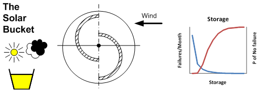
Doris - A thought experiment in progress (12) - And your point is?

Doris is a thought experiment running on a Raspberry Pi and a laptop which is intended to explore sustainable energy, an evolving description and discussion can by found in a previous posts starting with:
It is becoming generally accepted that energy storage can increase the proportion of energy generated from sustainable sources.  Regardless of my efforts with Doris, the aspiration supports international conferences and significant investments in technology are being made.  The concept is not futuristic, products such as Tesla's Power-Wall are coming to market and the internet-of-things which can provide data and control functions is evolving.  The question is where does it fit into the energy economy.  I'm an enthusiast for LED lighting, it works, I get payback (albeit on a small investment) and as we replace CFLs, our energy consumption is slowly falling.  For me as an energy consumer, the economics of storage don't work at present.

This is a well worn quote from the CEO of a cosmetics company; "In the factory we make chemicals and in the shop we sell dreams".  Similarly, we don't buy energy, we buy what it facilitates, e.g. lighting, cooking, entertainment etc.  Putting storage into the system does not cause us to use less energy, just gives us the option of increasing the diversity of sources.  Most consumers don't want a hike in their bills, but many might except higher unit costs if the total bill remained unchanged, thus a prerequisite to the adoption of storage might be energy management and efficiency which creates a cash flow for investment in storage.

At an industry level, the sustainable energy generation capacity is increasing, largely due to offshore wind farms.  However, wind farms are underpinned by conventional generating capacity.  The graph shows a breakdown of the sources of electricity on a pair of Saturday afternoons in October, one was a windy day and the other a calm one:

On the calm day, the gas and coal take over from the wind. This is a reasonably simple investment situation based on producing a product and selling it.  Having read the accounts of some generating companies, the owners of some gas fueled plant view  wind as a competitor and a complicating factor in their economics.  From a sustainability perspective (using number picked from thin air) it better to have four gas fueled plants and two wind farm rather than five gas fueled ones and one wind farm.  Storage helps achieve this.  However, the process of investing in storage rather than generating capacity is a complex one.

In the post war period until the 1990s electricity generation was managed by the CEGB.  In recent years the ownership of generating capacity has become highly diverse.  Participants include banks (possibly because of their deep understanding of markets), privatized power stations and interestingly Scandinavian companies with experience of offshore oil and gas operations have taken a position in the UK offshore wind sector. Would a larger element of central planning give a better outcome for emissions and sustainability?